
Best Image Sizes for Instagram, LinkedIn, YouTube & More
By Maria · 2026-09-22
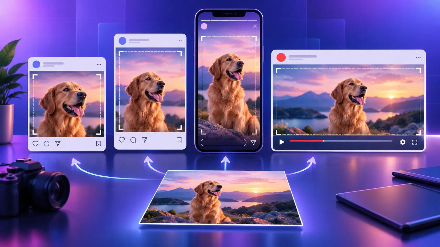
Find the best image sizes for Instagram, LinkedIn, YouTube, Facebook, X, TikTok and Pinterest, plus aspect ratios, safe zones and cropping tips.
A social media design can look perfect in your editor and still go wrong after upload. Important details may be cropped, the image can look blurry, unexpected padding may appear, or interface elements can cover text and graphics.
Part of the confusion comes from treating three different measurements as if they were the same: supported dimensions, recommended dimensions, and the dimensions users actually see after cropping or display adjustments.
This guide breaks down the current image-size specifications and recommendations for Instagram, LinkedIn, YouTube, Facebook, X, TikTok and other major platforms, so you can choose the right size before you design.
Summary
The best social media image size depends on where the image will appear, not just the platform itself. Feed posts, Stories, Reels, thumbnails and profile assets can all require different aspect ratios and dimensions.
Start with the correct aspect ratio, use enough resolution for a sharp result, and adapt one high-quality source image for each placement instead of forcing the same crop everywhere.
4:5 and 3:4 work well for many portrait feed posts, while 9:16 is the standard shape for full-screen Stories, Reels and similar vertical formats.
Recommended dimensions, minimum dimensions and supported aspect ratios are not the same thing, so check what each platform actually specifies.
Create a master image and adapt it into feed, square, vertical and widescreen versions rather than relying on one universal social media image size.
Social Media Image Sizes at a Glance
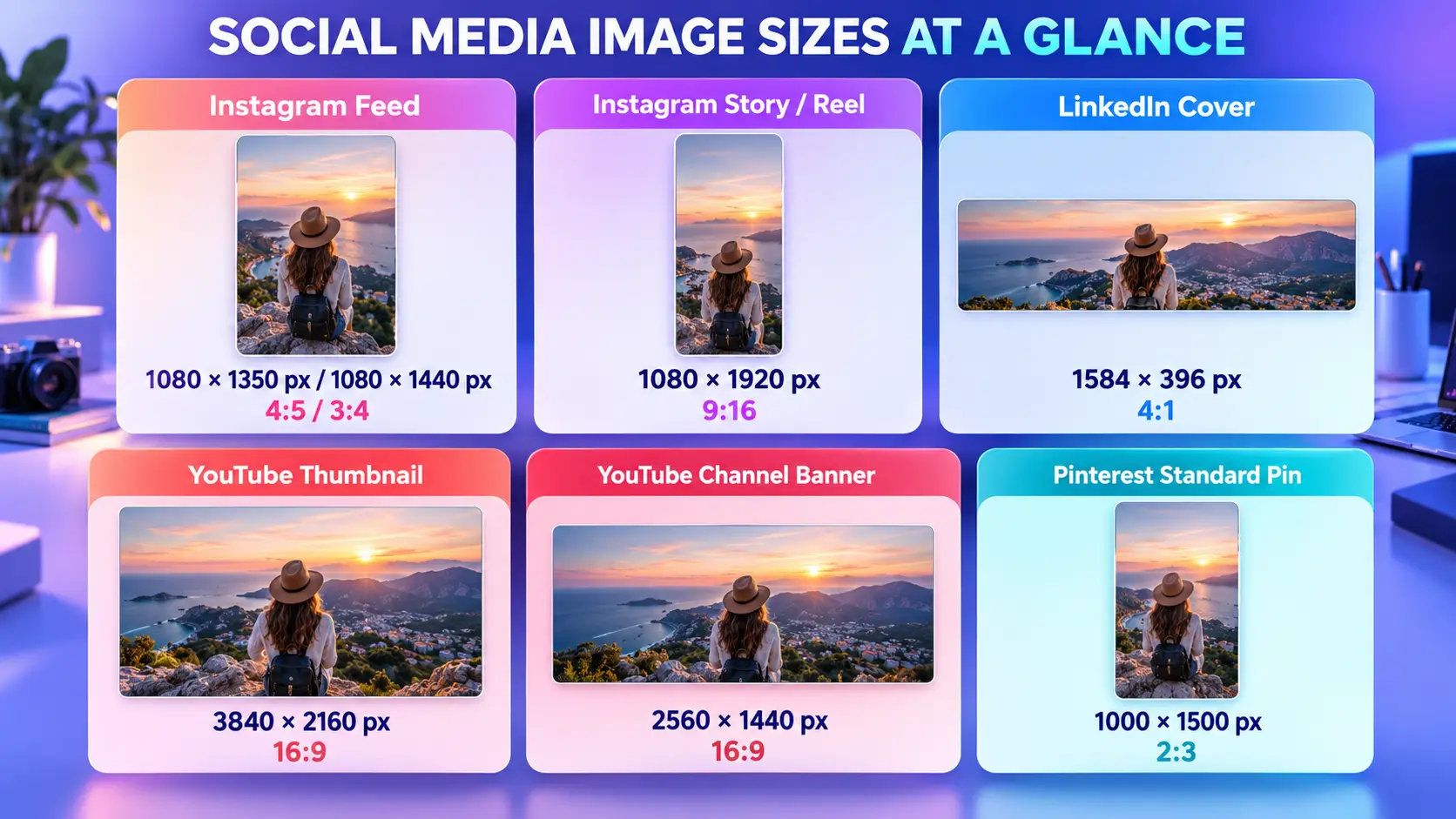
If you just need the most common social media post sizes, start here. These are practical working dimensions for some of the assets creators and marketers use most often.
Platform | Image Type | Recommended Size | Aspect Ratio |
|---|---|---|---|
Portrait feed post | 1080 × 1350 px or 1080 × 1440 px | 4:5 or 3:4 | |
Story / Reel | 1080 × 1920 px | 9:16 | |
Personal cover image | 1584 × 396 px | 4:1 | |
YouTube | Video thumbnail | 3840 × 2160 px | 16:9 |
YouTube | Channel banner | 2560 × 1440 px | 16:9 |
Standard Pin | 1000 × 1500 px | 2:3 |
These numbers do not all mean exactly the same thing. Some are recommended working dimensions, while others reflect a platform recommendation, minimum upload size or commonly supported format. The detailed sections below separate those differences so you know when a number is a recommendation rather than a hard requirement.
Instagram is a good example of why that distinction matters. A 1080 × 1350 px image at 4:5 is still a useful portrait format, but it is no longer the only tall feed option. Instagram added native support for 3:4 photos in May 2025, including both single-image posts and carousels. At 1080 pixels wide, that gives creators a practical 1080 × 1440 px working size without forcing a 3:4 smartphone photo into a 4:5 crop.
LinkedIn officially recommends 1584 × 396 px for a personal background photo. YouTube currently recommends 3840 × 2160 px for standard video thumbnails and 2560 × 1440 px for channel banners; YouTube also notes that banners can be cropped differently across devices. Pinterest recommends a 2:3 ratio, or 1000 × 1500 px, for standard image Pins and warns that taller ratios may be cut off in the feed.
Use this table as a quick starting point, not as a substitute for the platform-specific guidance below. Profile images, ads, carousels, banners and full-screen formats can have different requirements and the size you upload is not always the size viewers ultimately see.
Aspect Ratio vs Pixel Size: Which One Actually Controls the Crop?
Pixel size and aspect ratio affect an image in different ways.
Pixel dimensions affect resolution. They tell you how many pixels make up the image.
The aspect ratio determines its shape. It describes the relationship between the image’s width and height—and that is what usually matters most when a platform decides how an image fits into a particular placement.
For example:
Pixel Dimensions | Aspect Ratio | Shape |
|---|---|---|
1080 × 1080 px | 1:1 | Square |
1080 × 1350 px | 4:5 | Portrait |
1080 × 1920 px | 9:16 | Full-screen vertical |
This is why simply uploading a larger image does not solve a cropping problem.
A 2160 × 2160 image has much higher pixel dimensions than a 1080 × 1350 image, but it is still 1:1 rather than 4:5. If the placement is designed around a taller portrait ratio, the platform may still crop, resize or reframe the square image.
In other words:
More pixels can improve image quality, but they cannot fix the wrong image shape.
Don’t Forget the Safe Zone
Matching the correct canvas size is only part of the job.
An image can technically fit the required aspect ratio while important content near the edges is still hidden by interface elements such as:
profile names or captions;
buttons and engagement controls;
navigation elements;
video overlays;
automatic previews or crops.
That is why text, logos, faces and other important details should stay inside a safe zone rather than sitting directly against the edges of the design.
Later sections will give the appropriate sizes for each platform, but keep this rule in mind throughout the guide:
Use pixel dimensions for clarity, aspect ratio for shape, and safe zones to protect important content.
Instagram Image Sizes: Feed Posts, Stories, Reels and the New Taller Grid
There is no single “best” Instagram image size anymore. The right dimensions depend on where the image will appear and how much vertical space you want it to use.
For most creators, these are the Instagram image sizes worth knowing:
Instagram Format | Recommended Size | Aspect Ratio |
|---|---|---|
Square feed post | 1080 × 1080 px | 1:1 |
Portrait feed post | 1080 × 1350 px | 4:5 |
Native portrait photo | 1080 × 1440 px | 3:4 |
Landscape feed post | approx. 1080 × 566 px | 1.91:1 |
Instagram Story | 1080 × 1920 px | 9:16 |
Instagram Reel | 1080 × 1920 px | 9:16 |
Instagram Post Sizes: 4:5 Is Useful, but It Is No Longer the Only Portrait Choice
For years, 1080 × 1350 px at 4:5 has been one of the most useful Instagram post sizes because it gives a portrait image more vertical space in the feed than a square post.
It is still a strong choice when you want the image to take up more screen space while people scroll.
But Instagram now also supports 3:4 photos natively, including both single-image posts and carousels. The change, introduced in 2025, better matches the shape produced by many smartphone cameras and means a 3:4 photo no longer has to be forced into a 4:5 crop.
At 1080 pixels wide, a practical 3:4 working size is:
1080 × 1440 px
So the choice between 4:5 and 3:4 is less about finding one universal winner and more about the image you are working with:
Use 4:5 — 1080 × 1350 px when you want strong vertical presence in the feed.
Use 3:4 — 1080 × 1440 px when the original photo already uses the common phone-camera ratio and you want to preserve more of the frame.
Use 1:1 — 1080 × 1080 px when a square composition genuinely suits the design.
Use approximately 1.91:1 — 1080 × 566 px for wide landscape images.
Instagram Stories and Reels Sizes
For full-screen vertical content, the target is much simpler.
Both Instagram Stories image size and the standard canvas for Instagram Reels sizes are:
1080 × 1920 px — 9:16
This format fills a vertical phone screen and is the natural starting point for Stories and Reels.
Remember, however, that filling the 9:16 canvas does not mean every part of it is equally safe. Interface elements can sit over the content, so important text, faces and logos should remain away from the outer edges.
Feed Display and Profile-Grid Crop Are Not the Same Thing
This distinction has become especially important as Instagram has changed the way profiles look.
Instagram began replacing the traditional square profile-grid thumbnails with taller rectangular previews in 2025, reflecting the fact that much of the content uploaded to the platform is now vertical. Instagram continued expanding profile-grid controls in 2026, including tools for adjusting how thumbnails appear.
That means the same post can be presented differently in two places:
In the feed:
Instagram can display the uploaded post according to its supported aspect ratio, including 4:5 and the newer native 3:4 format.
On your profile grid:
Instagram displays a thumbnail or preview of that post inside the grid layout. The framing of that preview does not necessarily match the exact composition users see when they open the post.
This matters most when your image contains text, a face, a product or another focal point close to the edges. A design can look perfectly balanced when opened in the feed but feel tighter or differently framed when viewed as a profile thumbnail.
So when designing for Instagram, do not optimize only for the upload dimensions. Check both the full post and the profile-grid preview before treating the composition as finished.
LinkedIn Image Sizes: Posts, Profiles and Company Pages Are Not the Same
LinkedIn image sizes are easy to mix up because a personal profile, a Company Page, a regular photo post and a shared link preview all use different specifications.
If you only need the main numbers, start here:
LinkedIn Placement | Image Type | Recommended Size / Guidance | Aspect Ratio |
|---|---|---|---|
Personal Profile | Profile photo | At least 400 × 400 px | 1:1 |
Personal Profile | Cover image | 1584 × 396 px | 4:1 |
Company Page | Logo | 400 × 400 px recommended | 1:1 |
Company Page | Cover image | 1512 × 256 px recommended | Approx. 5.9:1 |
Feed Post | Regular photo | 1080 px wide recommended | 3:1 to 4:5 supported |
Link Preview | Shared URL image | 1200 × 627 px | 1.91:1 |
LinkedIn Post Image Size
For a regular photo post, LinkedIn does not prescribe one universal canvas size.
The platform currently requires an image to be at least 552 × 276 px and recommends using an image that is 1080 px wide for better image quality. Supported photo aspect ratios range from 3:1 to 4:5. If an uploaded image falls outside that range, LinkedIn may center and crop it to fit.
That means your LinkedIn post image size can vary depending on the content. A horizontal graphic, square image and portrait post can all work as long as they stay within the supported range.
For multi-image posts, layout becomes less predictable because LinkedIn uses the first uploaded image to help determine the arrangement. The overall image container can also render up to a 4:5 ratio, which makes the first image especially important when planning a gallery.
Personal LinkedIn Profile Images
Personal profiles use two separate image formats.
Profile photo:
Use an image of at least 400 × 400 px. LinkedIn accepts larger files, but choosing a square image that does not require aggressive cropping makes positioning easier.
Personal cover image:
The recommended size is 1584 × 396 px. LinkedIn notes that the exact appearance can change with browser-window size and screen resolution, so avoid putting critical text or graphics too close to the edges.
LinkedIn Company Page Image Sizes
Company Pages use different dimensions from personal profiles.
According to LinkedIn's current Page specifications:
Company logo: 400 × 400 px recommended
Company Page cover: 1512 × 256 px recommended
LinkedIn lists 268 × 268 px as the minimum logo size, while 400 × 400 px is the recommended working size. For the Page cover, both the listed minimum and recommended dimensions are 1512 × 256 px.
This is an important area to verify rather than copy from an older social-media size guide. Some resources still repeat previous Company Page cover dimensions, but LinkedIn's current Help documentation specifies 1512 × 256 px for the Page cover.
LinkedIn Link Preview Image Size
A shared URL works differently from a photo uploaded directly to a post.
For link-preview images, LinkedIn recommends:
1200 × 627 px — 1.91:1
LinkedIn specifically recommends the 1.91:1 ratio for customized Page post previews. Images with other proportions may display differently, including with padding in some contexts.
So before choosing a LinkedIn image size, first identify what you are actually creating: a feed image, profile asset, Company Page asset or link preview. They may all appear on LinkedIn, but they are not interchangeable.
YouTube Image Sizes: The Thumbnail Number You Remember May Be Outdated
If 1280 × 720 px is the YouTube thumbnail size you remember, your information may be out of date.
YouTube's current Help documentation recommends making custom thumbnails as large as possible and now lists 3840 × 2160 px for standard videos. For Shorts, the recommended thumbnail dimensions are 2160 × 3840 px.
Here are the YouTube image sizes most creators actually need:
YouTube Image Type | Recommended Size | Aspect Ratio | Important Note |
|---|---|---|---|
Standard video thumbnail | 3840 × 2160 px | 16:9 | Minimum width: 640 px |
Shorts thumbnail | 2160 × 3840 px | 9:16 | Minimum height: 640 px |
Channel banner | 2560 × 1440 px | 16:9 | Design important content for the safe area |
Minimum banner upload | 2048 × 1152 px | 16:9 | Text/logo safe area at this size: 1235 × 338 px |
YouTube Video Thumbnail Size
For a standard video, YouTube currently recommends:
3840 × 2160 px — 16:9
YouTube says custom thumbnails should be as large as possible and lists a minimum width of 640 px for regular video thumbnails. JPG and PNG are among the supported image formats.
The important change here is that 1280 × 720 is no longer the current recommended thumbnail resolution in YouTube's Help documentation. It is still a 16:9 image and may work, but if you are building a new thumbnail from scratch, the current recommendation is 3840 × 2160 px.
That distinction matters because a size can still be supported without being the platform's latest recommended working size.
YouTube Shorts Thumbnail Size
Shorts use a vertical format rather than the standard landscape thumbnail.
YouTube currently recommends:
2160 × 3840 px — 9:16
The minimum height is 640 px. YouTube also currently allows custom Shorts thumbnails to be added through YouTube Studio on a computer for verified accounts.
So avoid designing a Shorts thumbnail as if it were simply a smaller version of a 16:9 video thumbnail. The canvas is fundamentally different.
YouTube Channel Banner Size
For channel artwork, YouTube recommends:
2560 × 1440 px
The minimum upload size is:
2048 × 1152 px — 16:9
At that minimum size, YouTube defines a central 1235 × 338 px safe area for text and logos. Banner files should be 6 MB or smaller.
But the full 2560 × 1440 canvas should not be treated as equally safe.
Put Important Content in the Center, Not Across the Whole Banner
A YouTube channel banner is displayed across different devices, including phones, computers and larger screens. YouTube specifically warns that banner artwork can be cropped on certain devices and views.
That means the outer areas of your banner should mainly contain background imagery or visual elements that can disappear without hurting the design.
Keep essential elements such as:
your channel name;
logo;
tagline;
upload schedule;
calls to action;
important faces or products
close to the central safe region.
Think of the banner as two layers:
Center: content that must always remain visible.
Outer canvas: supporting artwork that can safely be cropped.
A banner can therefore meet the exact 2560 × 1440 px recommendation and still fail visually if the logo or text sits too close to the edges.
For YouTube, getting the canvas size right is only the first step. The thumbnail needs the correct aspect ratio, while the channel banner also needs a composition that survives device-specific cropping.
Facebook Image Sizes: Build for the Feed, Not Just the File
Facebook can display the same image differently depending on where it appears, so choosing a useful Facebook photo size is less about finding one universal number and more about designing for the placement.
For most organic content, these practical Facebook image sizes cover the formats you are most likely to need:
Facebook Format | Practical Working Size | Aspect Ratio |
|---|---|---|
Square feed post | 1080 × 1080 px | 1:1 |
Portrait feed image | 1080 × 1350 px | 4:5 |
Story / full-screen vertical | 1080 × 1920 px | 9:16 |
Profile photo | At least 320 × 320 px | 1:1 |
Facebook Feed Images
For a standard feed post, 1080 × 1080 px is a useful choice when the composition works best as a square.
If you want the image to occupy more vertical screen space, 1080 × 1350 px at 4:5 is a practical portrait canvas.
Neither size should be treated as the only format Facebook can display. Think of them as reliable working dimensions that make designing, exporting and repurposing content easier rather than rigid upload requirements.
Facebook Stories and Reels
For Stories, Reels and other full-screen vertical placements, design around a:
1080 × 1920 px — 9:16 canvas
Meta itself builds Reels creative around the vertical 9:16 format and emphasizes keeping important creative elements within safe areas rather than assuming the entire canvas will remain unobstructed.
As with Instagram, avoid putting essential text, logos or faces against the extreme top, bottom or sides where interface elements may compete with the design.
Facebook Profile Picture Size
For a Facebook profile or Page image, use a square source image of at least:
320 × 320 px
Facebook's current guidance recommends a 320 × 320 px profile image for best quality. The image is ultimately displayed smaller and cropped into a circle, so keep the face, logo or other identifying element centered and leave the corners nonessential.
The broader rule for Facebook is simple: design for how the image will appear in the feed or full-screen placement, not just for the dimensions of the file you upload.
X Image Sizes: You Have More Vertical Space Than You May Think
There is no single mandatory X image size for every photo post.
For profile branding, X currently recommends:
X Image Type | Recommended Size | Aspect Ratio |
|---|---|---|
Profile photo | 400 × 400 px | 1:1 |
Header image | 1500 × 500 px | 3:1 |
These dimensions come directly from X's current profile guidance. X also notes that header images can be cropped differently depending on browser and monitor size, so avoid placing essential text or logos against the outer edges.
What Size Should an X Post Image Be?
For a single-photo post, X gives creators more flexibility than many size guides suggest.
X says that single images with standard aspect ratios between 2:1 and 3:4 can display in full.
That means you can choose the format that fits the composition rather than forcing every post into one canvas:
use landscape when the scene needs horizontal space;
use square when the composition is naturally balanced;
use a portrait when you want to preserve a taller image.
For example, a 4:5 portrait image sits comfortably within X's supported range.
There is also no reason to assume that one orientation will automatically earn more engagement. Choose the shape based on what the image needs to show and how it will be reused elsewhere.
Pinterest Image Sizes: Why 2:3 Is Still the Format to Design Around
Pinterest is one platform where using the same 4:5 asset you prepared for every other feed is not always the best workflow.
For a standard Pin, Pinterest currently recommends:
1000 × 1500 px — 2:3
Pinterest also warns that Pins outside its recommended taller format may be cut off when they appear in people's feeds.
So if Pinterest matters to your distribution strategy, it usually makes sense to create a dedicated 2:3 version rather than automatically uploading a 1080 × 1350 social post.
The difference may look small in an editor, but it changes how much vertical space the image uses and how safely the full composition survives in the Pinterest feed.
For most creators, 1000 × 1500 px is the Pinterest image size worth designing around. You do not need to memorize every Pinterest advertising format unless you are specifically producing paid campaigns.
TikTok Image Sizes: Think Full-Screen First
TikTok should be approached as a vertical, mobile-first environment.
A practical working size for full-screen TikTok creative is:
1080 × 1920 px — 9:16
TikTok's own creative guidance recommends framing content vertically at 9:16, using high-resolution media and leaving enough room for the platform interface.
That last point matters just as much as the canvas dimensions.
Buttons, captions, account information and other interface elements occupy parts of the screen. A design may technically fill the entire 9:16 canvas while still placing a face, product, logo or line of text underneath the UI.
Keep the visual focus closer to the central working area and treat the outer edges as less reliable space.
For a general guide to TikTok image sizes, it is more useful to remember:
Vertical canvas + sufficient resolution + protected safe space
than to mix organic image posts, video requirements and paid-ad specifications into one long table.
If you are building an ad rather than an organic post, check the specification for that exact ad placement separately. TikTok's ad requirements vary by format and should not be treated as universal organic-post rules.
Can One Image Size Work Across Instagram, Facebook, LinkedIn and X?
Sometimes—but accepted everywhere is not the same as optimized everywhere.
Consider a 1080 × 1350 px image at 4:5.
That portrait canvas can be useful across several feed-based platforms. Instagram supports it, LinkedIn supports photo ratios down to 4:5, and it also sits within X's supported single-image range.
So technically, you may be able to reuse the same file.
The problem is what happens around the file.
One platform may show more of the image in the feed. Another may present a different profile-grid preview. Interface elements may occupy different areas, and some placements may reframe or crop the asset differently.
Then there are platforms that need fundamentally different shapes.
Pinterest is better served by 2:3. Stories, Reels and other full-screen vertical placements use 9:16. A standard YouTube thumbnail uses 16:9.
So instead of looking for one universal social media post size, create a master asset that can be adapted.
A practical workflow looks like this:
Master Image → 4:5 Feed → 1:1 Square → 9:16 Story → 16:9 Thumbnail
The goal is not to export one image and hope every platform treats it nicely. The goal is to preserve the same visual idea while creating the correct version for each placement.
Crop, Pad or Extend? Choose the Right Way to Change an Image Ratio
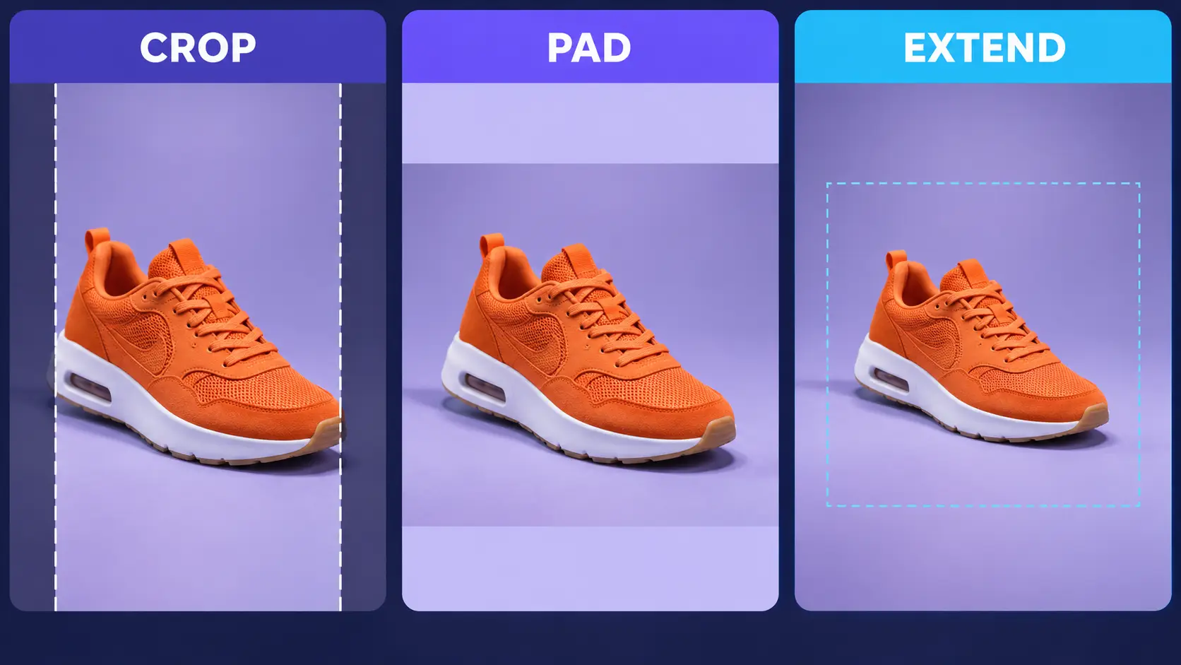
Once you know the required aspect ratio, the next question is how to get your existing photo into that shape. There are three fundamentally different approaches.
Crop
Cropping removes parts of the original image. It works well when there is enough unused space around the subject and cutting the edges does not remove anything important.
For example, turning a loosely framed photo into a 4:5 Instagram post may only require trimming some background from the left and right.
The risk is straightforward: crop too aggressively and you may lose part of the subject, product, text or composition.
Pad
Padding keeps the entire original image and adds space around it. This is useful when preserving every original pixel matters more than filling the new canvas edge to edge.
A wide image placed inside a square canvas, for example, could keep its complete composition with additional space above and below.
The tradeoff is that the result may contain visible margins rather than filling the entire frame.
Extend
Extending changes the canvas differently. Instead of removing part of the original or adding simple empty space, an image-expansion workflow generates additional surroundings around the existing photo.
This can be useful when the subject cannot safely be cropped but you still want the new image to feel full-frame.
Generated surroundings should still be checked carefully, especially around structured objects, patterns, text and fine details. Extension creates new visual content; it does not reveal pixels that existed outside the original photograph.
Choose the Method Before You Resize
A simple rule is:
Have an expendable background? → Crop
Need every original pixel? → Pad
Need a larger scene without cutting the subject? → Extend
If crop or pad is the right option, Betatum's AI Image Resizer can turn a source image into square, portrait, Story or widescreen ratios while letting you choose between cropping and padding. Its subject-aware cropping is designed to help keep important content in the frame rather than blindly cutting from the center.
That makes it useful when one source photo needs several versions for different social platforms without manually rebuilding every canvas.
What If Your Image Is the Right Shape but Still Looks Blurry?
Getting the aspect ratio right does not guarantee a sharp result.
An image may already be the correct 4:5, 9:16 or 16:9 shape but still contain too few pixels for the size at which it needs to be displayed.
If that small source image is enlarged conventionally, it can become soft or visibly pixelated.
Start with a few basic checks:
use the highest-quality original available;
avoid cropping away more resolution than necessary;
avoid repeatedly downloading and re-uploading compressed copies;
upscale only when the source genuinely does not contain enough resolution.
This is a different problem from choosing the wrong aspect ratio.
Wrong ratio → reshape the canvas.
Insufficient resolution → improve the usable image size.
If the source image is too small, AI Photo Upscaler currently supports enlargement up to 8×.
AI upscaling should not, however, be described as recovering the exact original detail that was never captured. An AI model may reconstruct plausible additional detail while enlarging the image, but that reconstructed information is not necessarily identical to what existed in the real scene.
Conclusion
There is no single best image size for every social network. Start with the placement where the image will appear, match the appropriate aspect ratio, make sure the source has enough resolution, and then adapt the original for other platforms rather than forcing one crop everywhere.
If one photo needs to become square, portrait, story and widescreen versions, Image Resizer AI can help reformat it using crop or padding options while keeping the subject in mind.