
Product Photography Backgrounds That Make Products Pop
By Maria · 2026-09-18
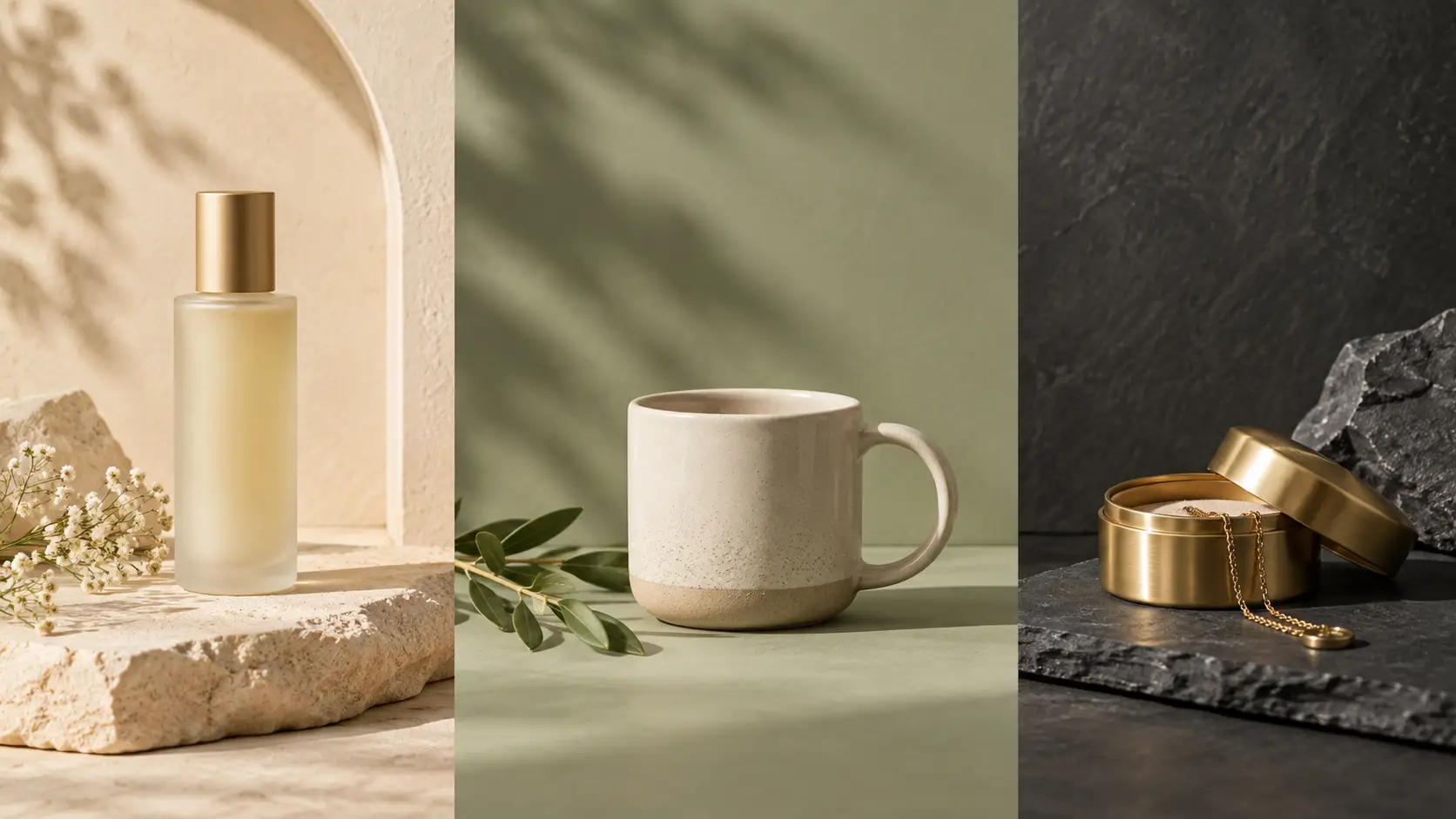
Discover 10 product photography background ideas, when each works, and how to choose the right backdrop for ecommerce, ads, social campaigns, and product pages.
The best product photography background ideas are not always the boldest. A good background should make the product easier to notice and understand—not compete with it.
The right background can support a product’s color, shape, texture, material, or intended use while keeping the item visually dominant. That matters in ecommerce: 90% of shoppers surveyed by Etsy said photo quality was extremely or very important to their purchase decision.
So which backgrounds work best for different products? How much color or texture is too much? And when should you choose a clean studio background over a styled or contextual scene? This guide answers those questions.
Quick Summary
The best product photography background is the one that keeps the product clear, accurate, and visually dominant. Different products and channels may need different background styles.
Use white or neutral backgrounds when clarity and comparison matter most.
Add color, texture, or context only when it helps the product communicate more clearly.
Match the background to the product’s color, material, and positioning.
Adapt the background to the channel, from marketplace listings to ads and social campaigns.
When testing AI backgrounds, change the setting without altering the product itself.
What Actually Makes a Product “Pop” Against a Background?
Making a product “pop” does not mean making the background louder. It means creating enough visual separation and hierarchy that shoppers notice the product first, understand it quickly, and are not distracted by everything around it.
Four factors matter most:
Separation: The product’s edges should be easy to distinguish from the background. Poor contrast can make similar colors or shapes visually blend together.
Visual hierarchy: The product should remain the main point of attention. Props, patterns, shadows, and scenery should support the composition rather than compete with it.
Color relationship: A background can complement, contrast with, or reinforce a product’s color—but it should not make the product look dull, distorted, or visually overwhelmed.
Controlled complexity: Some texture or context can make an image more interesting, but every additional element competes for attention.
Research supports that last point. A 2020 Journal of Business Research eye-tracking study found that product images with more complex backgrounds attracted more attention, but much of that attention shifted toward the background rather than the focal product. In that experiment, moderate background complexity produced the strongest results for product-information processing and purchase intention.
That does not mean a medium-detail background will always sell better. The practical takeaway is simpler: more visual complexity is not automatically more effective. The right amount depends on the product, the information shoppers need, and the role that particular image plays in the product gallery.
10 Product Photography Background Ideas and When Each One Works
The best background for product photography depends on what the image needs to do. A catalog photo may need maximum clarity, while a campaign image may benefit from more color, texture, or context.
For each background, consider three things: what it works best for, why it helps the product, and what can go wrong.
1. Clean White: When the Product Needs Zero Competition

Best for: Ecommerce catalogs, product comparisons, electronics, tools, packaged goods, and marketplace main images.
Why it works: White keeps the visual field simple. It makes the product easy to see and helps shoppers compare shape, color, packaging, and features across several items.
For some marketplaces, white is also a requirement. Amazon currently requires MAIN product images to use a pure white background with RGB values of 255, 255, 255. The product should also fill at least 85% of the image frame.
Main risk: Very light products can lose definition against white. White packaging, transparent materials, silver objects, and pale products may need better lighting, visible shadows, or subtle tonal separation to keep their edges clear.
White works because it creates clarity and consistency, not because it automatically sells better.
2. Soft Gray and Warm Neutrals: Clean Without Feeling Clinical
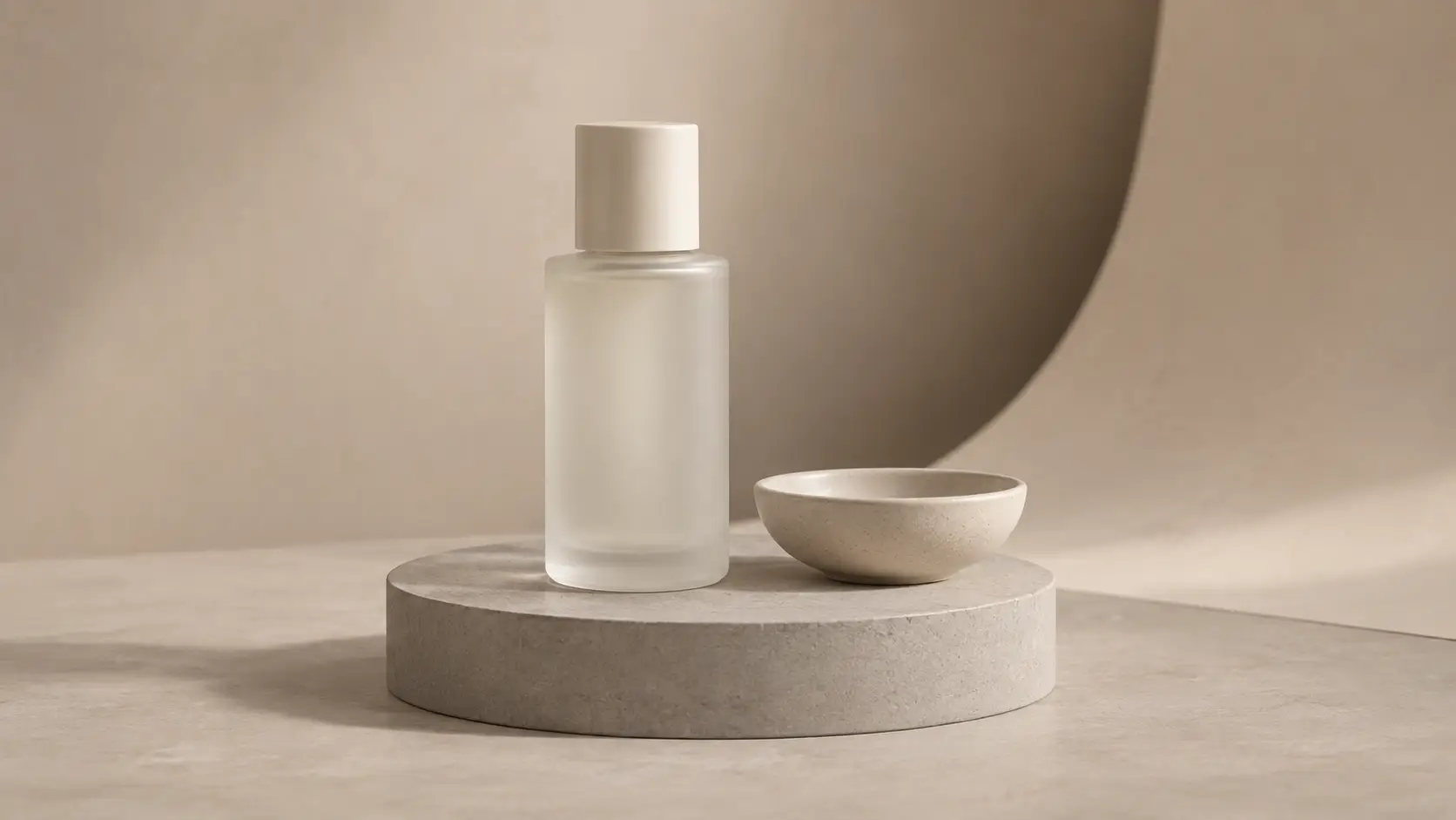
Best for: Skincare, ceramics, homeware, fashion accessories, and minimalist products.
Why it works: Gray, beige, cream, and taupe keep the background simple while adding more tonal separation than pure white in some situations.
They can work particularly well for pale packaging, transparent products, or subtle shapes that might blend into a white background.
Neutral product photo backgrounds can also help a collection feel visually consistent without introducing a strong competing color.
Main risk: Neutral does not mean suitable for every product. A beige item on a similar beige background can still look flat.
The product needs enough contrast from the background to remain easy to see.
3. Black or Dark Backgrounds: Create Stronger Edges and Contrast
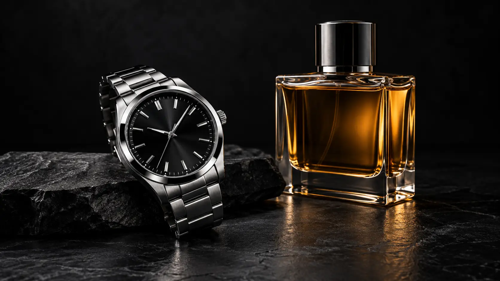
Best for: Watches, fragrance, jewelry, premium electronics, metallic products, and distinctive packaging.
Why it works: Dark backgrounds can make highlights, reflections, metallic edges, and illuminated details stand out.
Glass, chrome, polished metal, and reflective surfaces can look especially striking when the lighting clearly defines their shape.
Main risk: Black does not automatically make a product look luxurious.
A dark product can disappear into a dark background. Poor lighting can also hide important details on reflective surfaces.
Choose a dark backdrop when it improves the product's visibility and presentation, not simply because the product should look more expensive.
4. Solid Color: Support the Product or Brand
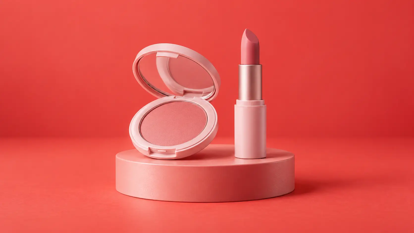
Best for: Cosmetics, food and beverages, accessories, branded campaigns, social ads, and product collections.
Why it works: A single-color background adds personality without requiring props or a complicated scene.
What matters most is the relationship between the product color and the background color.
Contrast can make the product easier to notice. A similar or related color can create a more cohesive image. Neither approach is always better.
Main risk: Maximum contrast can become distracting. If the background attracts attention before the product, the composition is working against the item.
Avoid choosing colors based on simple claims such as "blue creates trust" or "red creates urgency." Color should be judged in relation to the actual product, brand, audience, and image.
5. Gradient Backgrounds: Add Depth Without Creating a Full Scene

Best for: Cosmetics, beverages, beauty products, tech accessories, and campaign imagery.
Why it works: A subtle gradient can add depth to a simple product photo without introducing props or a complete environment.
Changes in brightness or color can help define the product's shape and prevent the image from feeling completely flat.
This makes gradients useful when a plain studio background feels too simple, but a lifestyle scene would add unnecessary detail.
Main risk: The brightest or most contrasting part of the gradient can become the focal point.
Keep the strongest part of the gradient close enough to support the product rather than pulling attention toward an empty part of the image.
6. Stone, Concrete, or Marble: Add Texture Without Building a Scene
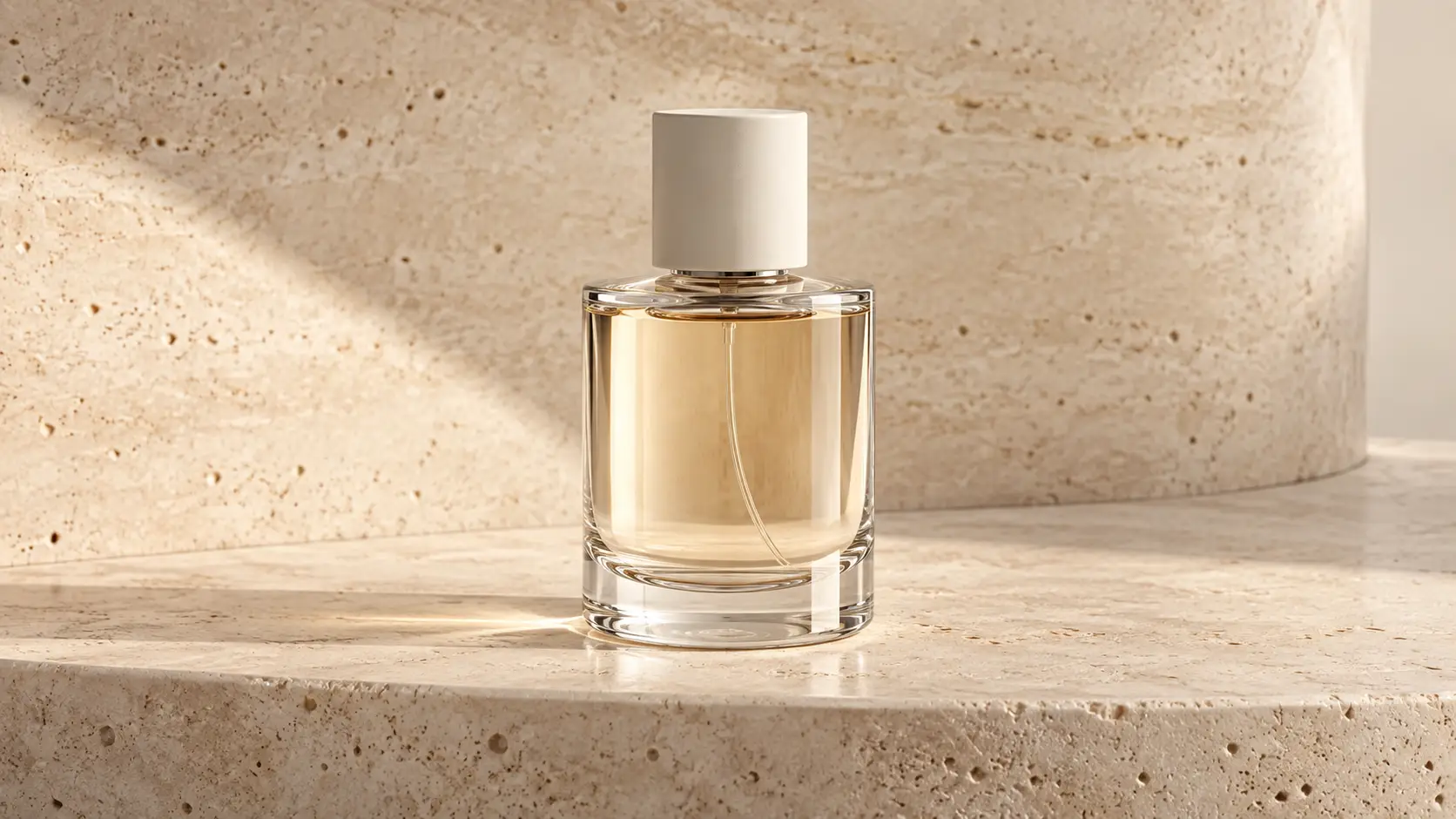
Best for: Skincare, candles, fragrance, jewelry, kitchen products, and premium packaging.
Why it works: These materials add texture and visual depth without creating a complete lifestyle setting.
Concrete can make an image feel more tactile. Marble can create a polished appearance. Stone can give smaller products a stronger visual base.
The goal is to add surface character, not build an entire story around the product.
Main risk: Strong veins, cracks, patterns, and color changes can easily compete with small products or detailed packaging.
The texture should remain part of the background.
7. Wood and Natural Surfaces: Use Material That Fits the Product

Best for: Food, kitchenware, handmade products, candles, craft goods, and some skincare products.
Why it works: Natural surfaces can add warmth and texture when they make sense for the product.
For example, cookware on a wooden kitchen surface feels natural because the setting relates to how the product might actually be used. A wooden tabletop can also provide a believable setting for food or ceramics.
Main risk: A wooden background should not be used to suggest qualities the product does not have.
Wood does not automatically mean handmade, organic, sustainable, or environmentally friendly.
Use natural materials because they fit the composition and product context.
8. Fabric and Soft Textures: Add Softness and Depth
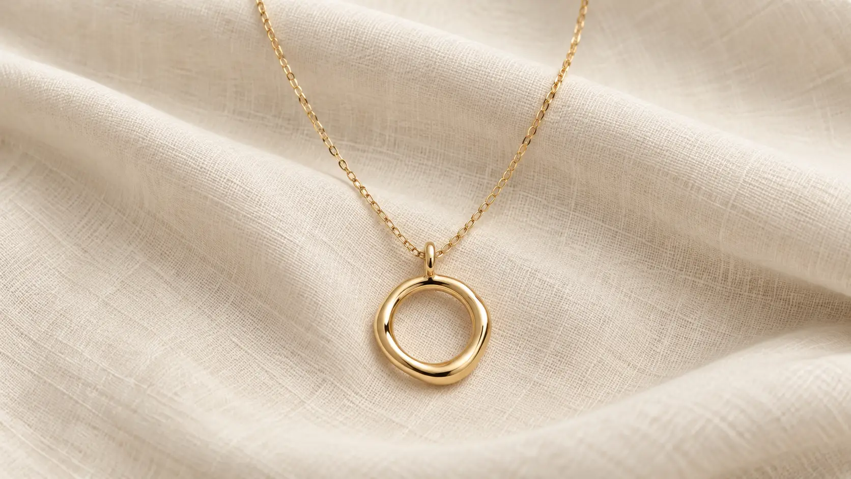
Best for: Jewelry, perfume, fashion accessories, beauty products, and gifts.
Why it works: Linen, cotton, velvet, and other fabrics can introduce softness, texture, and depth.
They can be especially effective when paired with products that are rigid, polished, metallic, or reflective.
Main risk: Fabric can become distracting very quickly.
Large folds, wrinkles, shiny areas, or strong patterns can compete with the product. Velvet should not automatically be used for every item that needs to look premium.
Choose a fabric that visually supports the specific product.
9. Simple Geometric Sets and Pedestals: Give the Product Structure

Best for: Beauty products, small electronics, accessories, packaged goods, and editorial campaign images.
Why it works: Podiums, blocks, arches, circles, and simple geometric shapes create depth without requiring a complete lifestyle environment.
They can also help arrange several products, create different heights, or give a small object a stronger position within the frame.
This approach works well when a flat product photography backdrop feels too simple.
Main risk: Too many shapes can make the setup more noticeable than the product.
Keep the geometry simple. The shopper should notice the product first and the set design second.
10. Real-World or Lifestyle Backgrounds: Show the Product in Context

Best for: Products where shoppers need to understand use, scale, placement, fit, or occasion.
For example:
a lamp on a bedside table
cookware in a kitchen
skincare on a bathroom counter
a backpack worn by a person or shown during travel
furniture inside a room
Why it works: A realistic setting can answer questions that a plain studio image cannot.
Seeing a lamp beside a bed helps shoppers judge its scale. Showing a backpack on a person gives a clearer sense of fit. Placing furniture in a room helps shoppers imagine how much space it takes up.
Etsy also recommends using props when they help communicate context, scale, size, or use. However, Etsy advises sellers to make sure props do not distract from the product or make shoppers unsure about what is actually included in the purchase.
Main risk: The environment needs to feel believable and relevant.
Too many props can hide useful product details or create confusion. A lifestyle background works best when the setting answers a real buying question.
The rule across all 10 product photography background ideas is simple: the background should help shoppers notice or understand the product more easily. If the background demands more attention than the product, it is doing too much.
Should the Background Match the Product or Contrast With It?
The background does not have to match the product, and it does not have to create the strongest possible contrast either. What matters is whether the product stays easy to see, its color still looks accurate, and the overall combination makes sense for the way the product is being presented.
For some products, a closely related background color can create a clean, cohesive look. For others, stronger contrast can make the shape, packaging, or details easier to notice. The right choice depends on more than a simple color-wheel rule.
Research supports that idea. A 2020 Psychology & Marketing study examined product and background color combinations across four empirical analyses. The researchers found that similar color combinations led to stronger evaluations for the functional products used in the study, while more contrasting combinations performed better for the sensory-social products they tested.
That does not mean functional products should always use matching colors or that beauty, fashion, or lifestyle products should always use contrast. The more useful takeaway is that the effect of a background color depends on the product, the visual context, and what the image is trying to communicate.
Instead of asking whether the background should match or contrast, check four things:
Are the product edges immediately clear?
Does the product still look like its true color?
Does the background fit the product's positioning and overall visual style?
Does your eye go to the product before the background?
If those four conditions are met, the color combination is probably working.
The best product photography background color is not the one that follows a fixed formula. It is the one that gives the product enough separation while still making the image feel intentional and believable.
Match the Background to the Product, Not Just the Trend
A background can look great in another brand's campaign and still be wrong for your product. Start with the product's color, material, size, details, and the information shoppers need to see clearly. Then test backgrounds that support those qualities.
Product Type | Backgrounds Worth Testing | Watch Out For |
|---|---|---|
Jewelry | Neutral, dark, fabric, subtle stone | Reflections, glare, and fine edges disappearing into the background |
Skincare & Cosmetics | Neutral, pastel, gradient, stone | Background colors changing how the packaging color appears |
Electronics | White, gray, dark, subtle gradient | Ports, controls, screens, or dark edges becoming difficult to see |
Food & Beverage | Natural surfaces, solid color, contextual settings | Props or styling becoming more noticeable than the product |
Homeware | Neutral, wood, stone, lifestyle settings | Creating a misleading impression of size or scale |
Fashion Accessories | Neutral, solid color, lifestyle settings | Background colors or patterns competing with the product's material or design |
Handmade Goods | Neutral, wood, simple contextual settings | Making the scene more detailed than the object itself |
Luxury Packaging | Dark, neutral, stone, fabric | Dramatic styling hiding labels, finishes, edges, or packaging details |
These combinations are starting points to test, not universal rules. The same product may work well against several backgrounds depending on whether the image is meant for a marketplace listing, product gallery, social campaign, or lifestyle shot.
When comparing options, keep the product, lighting, and framing consistent. Then look for the background that preserves clear edges, accurate color, visible details, and strong product focus without adding unnecessary distraction.
The Best Background Can Change Depending on Where the Image Will Appear
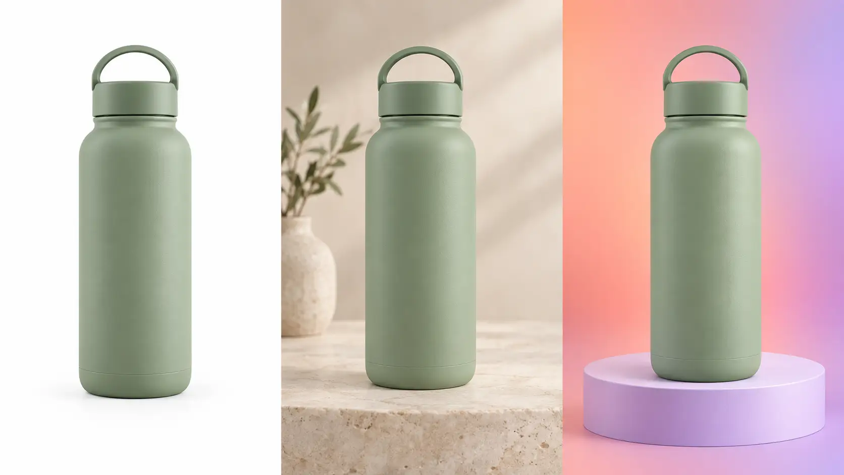
One background does not need to work across every channel. The right choice depends on where the image appears and what the image needs to do.
Marketplace Main Images
Marketplace rules may limit creative choices. Amazon, for example, requires qualifying MAIN images to use a pure white background and does not allow added text, graphics, or unrelated props.
Your Ecommerce Product Page
A brand-owned store gives you more flexibility. Clean, consistent backgrounds can make products easier to compare, while secondary images can introduce texture, scale, or real-world context.
Ads and Social Campaigns
Ads and social images can be more expressive. Solid colors, gradients, geometric sets, seasonal styling, or lifestyle backgrounds may work better when the goal is to attract attention quickly.
The key is to adapt the background to the channel instead of forcing one image style to do every job.
Don’t Have the Right Background? You May Not Need Another Photoshoot
If the original product photo is sharp, well lit, and accurately shows the product, you may not need to reshoot it just to test new backgrounds. A clean source image can often be reused across several styles, including studio looks, brand colors, gradients, contextual scenes, and campaign visuals.
This is where AI product photography can help. Instead of rebuilding the product, it can place the same product into different background directions more efficiently. The goal is simple: change the setting, not the product.
A practical workflow looks like this:
Start with a sharp, well lit source image.
Isolate the product cleanly.
Test several background directions.
Match the new lighting and contact shadow to the original product.
Check the product geometry, text, logos, materials, and colors before publishing.
Export the version that fits each channel.
For example, AI Product Photography can place a product on clean studio or lifestyle backdrops, while AI Background Removal can create an isolated product cutout for reuse across different layouts.
The key is to use AI to adapt the presentation, not to invent missing product details. Keep the product itself true to the original photo.
The Rule to Remember: Make the Product Pop, Not Compete
There is no single best background for every product. Start with clear product visibility, add only the context or character the image needs, and adapt the background to the channel where the image will appear. The best background is the one that supports the product without competing with it.
If you want to test different studio and lifestyle looks without another full photoshoot, try Betatum’s AI Product Photography workflow and compare which setting presents your product most clearly.